Steve Jobs would never have allowed this
One of Steve Jobs’ many philosophies at Apple was to give customers what they need, not necessarily what they want. He said, “People don’t know what they want until you show them.” This is why I never rely on market research. Our task is to read things that are not yet on the page. At […]

One of Steve Jobs’ many philosophies at Apple was to give customers what they need, not necessarily what they want. He said, “People don’t know what they want until you show them.” This is why I never rely on market research. Our task is to read things that are not yet on the page.
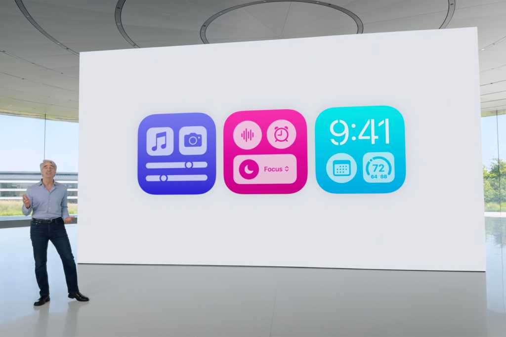
At WWDC this week, Apple showed us a ton of features that were already on the page. Several chapters back, in fact. One of the biggest features of iOS 18 is a whole new level of customization that permeates the entire interface, from the Home screen layout to the Lock screen, icons and Center. control. It doesn’t even have a fancy name, it simply falls under Personalization.
On the surface, everything is fine. Apple users have been asking for Android-like customization for years and Apple absolutely delivered it in iOS 18:
- Place icons wherever you want on your home screen
- Tint apps with a dark look and adjust the color
- Hide app names under icons
- Adjust the size of apps and widgets
- Add buttons to the Control Center
- Rearrange and resize Control Center icons and sliders
- Replace lock screen controls
All of these items have been on wishlists for years, and for the first time, your iPhone is as endlessly customizable as an Android phone, maybe even more so. Out of the box, you can customize the look of your iPhone’s home screens in a variety of ways, but after seeing what some early beta users did, that might not be such a good idea to give users so much choice.
Of course, as with all options, you can ignore what you don’t want; but so many options create unnecessary visual chaos and confusion. Where Control Center was once a controlled list of buttons and sliders, it is now several pages of options with a somewhat fuzzy hierarchy. We’ve been asking for this level of customization on our iPhones for years, but now that we have it, it feels cheap, convoluted, and a little different from Apple.
It goes back to Steve’s mantra: what you think you want isn’t always what you want. The features that generated the most buzz (iPhone Mirroring, Safari Highlights, Math Notes) weren’t things we knew we wanted, but they will likely become part of our workflow. This is Apple at its best. That other thing that lets users change the color of icons? Not really.
But that’s how it is these days. Now, Apple is doing its best to strike a balance between what users want and need, while still offering exciting and revolutionary features. Tim Cook has delivered incredible products and continues to chart exciting new paths for Apple, including with Apple Intelligence, another feature in iOS 18.
It’s impossible to imagine what Apple would look like under Steve Jobs in 2024. I’d like to think he would be OK with Apple Intelligence, Vision Pro, and even the many Apple Pencils. But one thing is certain: he would never let us dye our icons.


